The light of life
By Alessio Candido
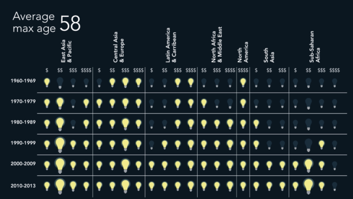
With this visualization is possible to see what’s the average max age of people from different types of country (divided geographically and by wealth) during the last 50 years (1960-2013). It’s possible to see a general increase in the average max age, especially in richer countries. Sub-saharan Africa and South Asia are generally the least vital, where North America is the most. The visualization uses the lighting bulbs as a metaphor: when the bulb dies, the average max year of the country is finished. The visualization is enhanced using the sound: the death of a bulb is underlined by a specific sound.