PLUS
By Patricia Mancera
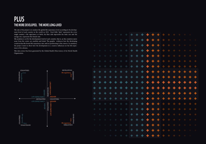
The aim of the project is to analyze the global life expectancy level according to the development level of each country in the world on 2011. Each little ‘plus’ represents the every single country ́s life expectancy at birth; the blue side represents the male rate and the orange one, represents the female rate. The position is set by the development level of each country, that is, as the countries move away from the center, are smallest and faded. e graphic evidences how the developing countries has the lowest life expectancy rate, and are positioning in the corners. In summary, the project wants to show how the development in a country influences on the life expectancy of its citizens.The data extract has been generated by the Global Health Observatory of the World Health Organization.