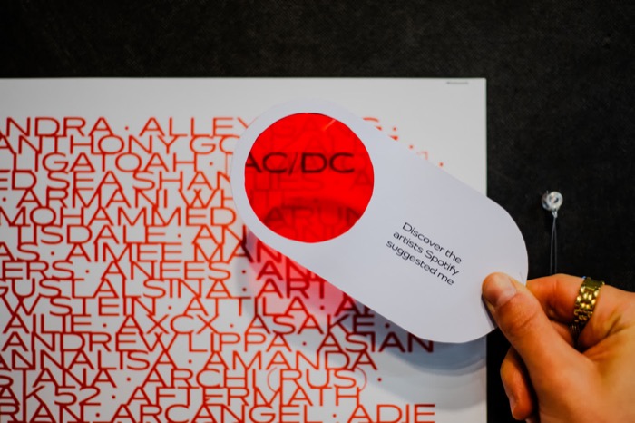
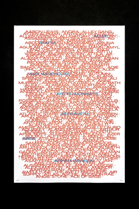
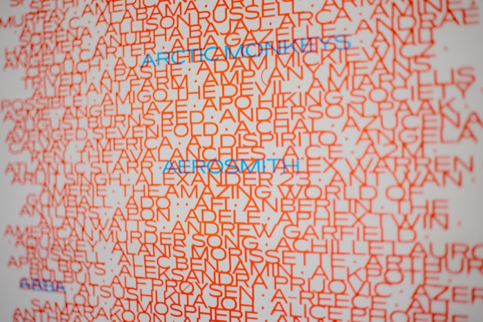
“A” filter

By Carolina Jacomin Da Silva

The data set reveals Spotify’s meticulous tailoring of suggestions. The algorithm, prioritizing familiarity, (maybe) unintentionally constructs a filter bubble. Red Lists 256 unordered artists while light blue, visible with a lens, displays the seven suggested ones, the ones that are inside my preferences: liked songs, genres, artists, etc. This visual representation encapsulates the tension between personalized curation and the potential loss of diverse musical discovery within algorithmic echo chambers. The project questions the balance between personalization and exploration, symbolizing how algorithms shape our digital experiences.

Featured image of the project “A” filter Complementary image of the project “A” filter Complementary image of the project “A” filter

Metaphor used:

The chosen metaphor is an poster that provides different information if you read it with or without a lens. By using the lens, the visitor can see a simulation of artist suggestions from Spotify search queries, while if the user approach the poster without the lens, they can see more results, outside of my preexisting preferences.

Intended Meaning:

My design wants to communicate exactly how i feel when i see Spotify suggestions. It feels like I am seeing filtered results even though i didn't opt for it. It is like a lens that prevents me from seeing everything, instead it redirects me to what I already know, so there's less room for accidental or spontaneous exploration.

Source:

Record of search history and the results provided on Spotify, from August to October 2023.